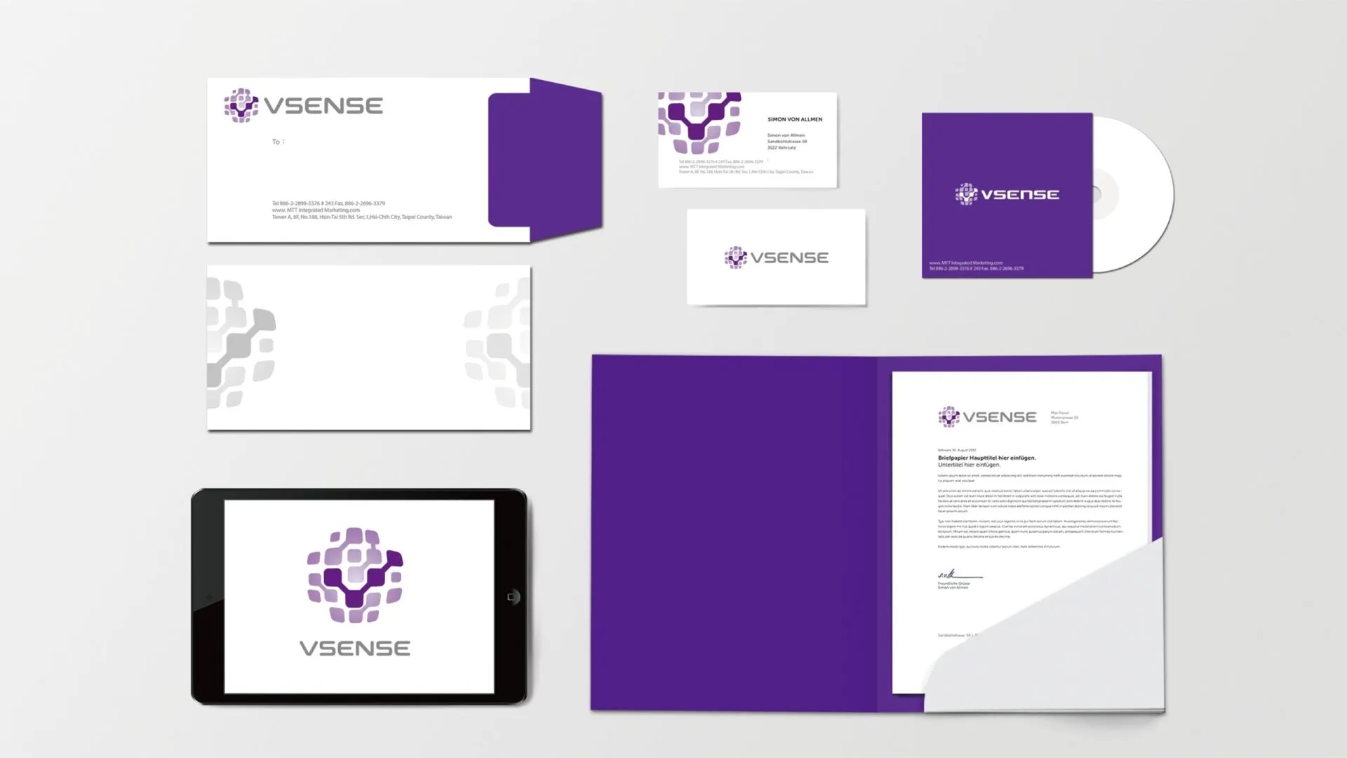
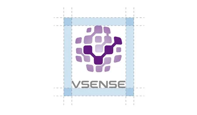
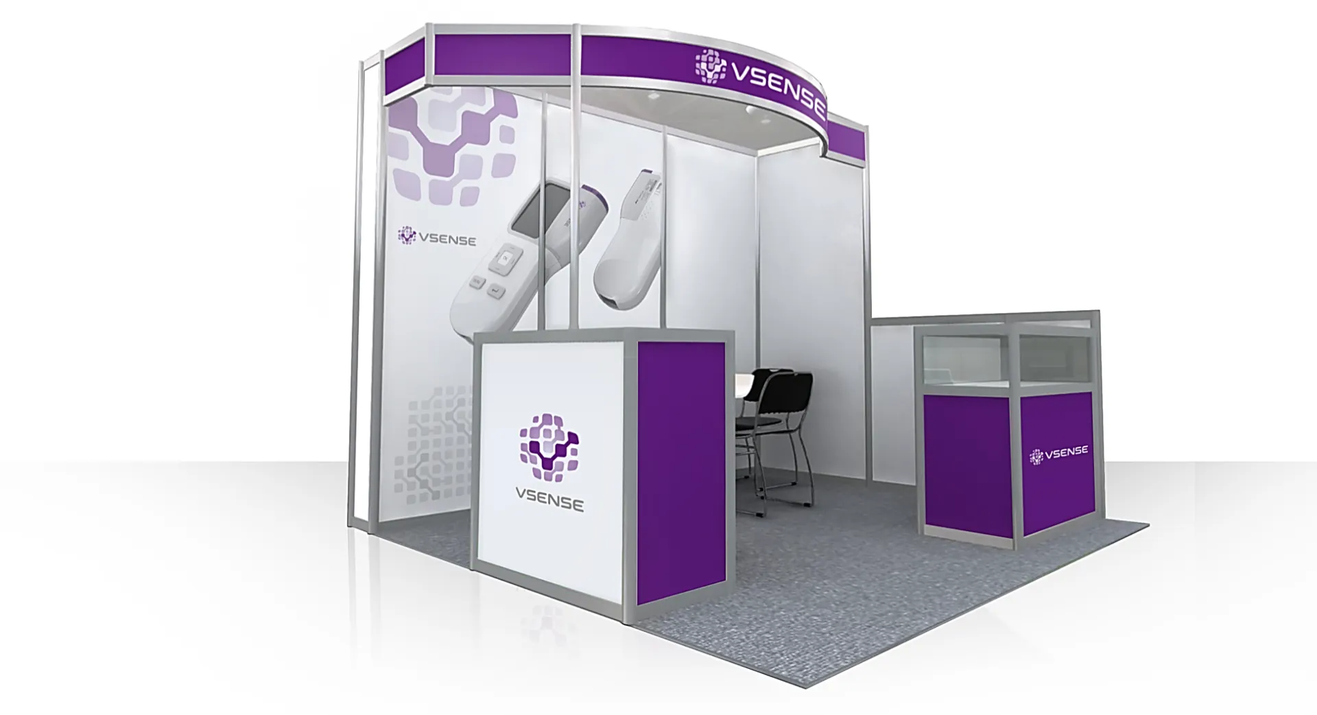
The brand logo is rooted in the client’s core technology, utilizing geometric forms that visualize their technical expertise and service philosophy.
Guided by market and industry research, we developed a strategic visual system and color palette. This ensures the final identity is not just a design, but a high-value brand asset optimized for the client’s competitive landscape.